How I’d Design a Brand
Carey’s Cookies
As a fun example, here’s a peek at how I designed a brand identity for “Carey’s Cookies.”
I love to bake! I bake a lot of cookies in college, and my friends are always telling me how good they are and joking about how I should sell my baked goods. That got me thinking: if I were to start my own business, what would my logo look like? What would my brand identity be? Curiosity and creativity got the best of me, and I ended up making a brand identity for my fictitious (but maybe it’ll be real someday!) company: Carey’s Cookies.
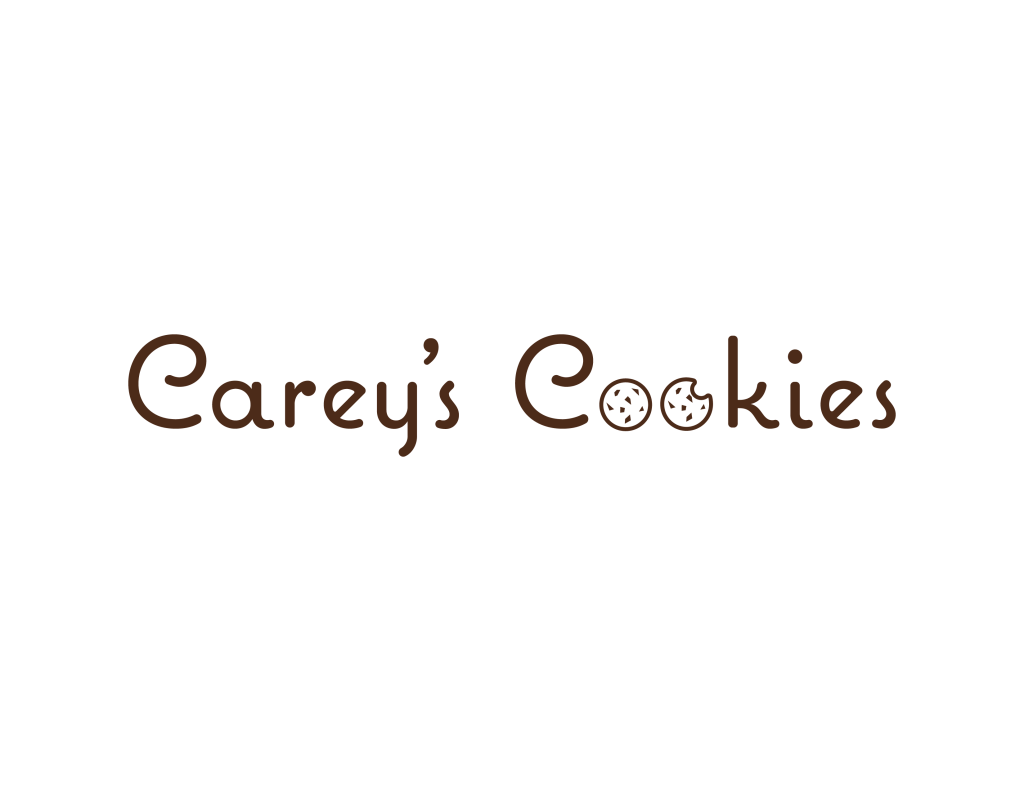
From there, I moved on to spicing up the design. Since I was designing for a cookie company, I thought it would be fitting to swap out the “o’s” for cookies. But I didn’t want both “o’s” to be whole cookies, so I made the second one look like it had a bite taken out of it. This showed the progression from buying a cookie to eating said cookie and also helped to make the design more unique.
The last thing I did was to craft the chocolate chips in the cookies (the chocolate ties back into the deep brown color). I noticed that, up until this point, my design had consisted of a lot of roundness – rounded edges, circles, etc. Therefore, I made the chocolate chips have flat edges and sharp angles. Although they’re small, they broke up the monotony of “roundness” in the design and made the final result pop.
For profile photos and web icons, an abbreviated logo with a 1:1 ratio is beneficial. Guess what basically has a 1:1 ratio? A cookie!
I played around with several different iterations of the same idea. I knew I wanted a circle (the cookie) with the “c” in the center (frosting swirl) and eventually went with the above design. Filling in the entire “c” with one color made the icon look tacky, but I liked how this outlined version was professional while still looking fun and unique. To keep uniformity, I made the light outline the same peach color as the background of the label.
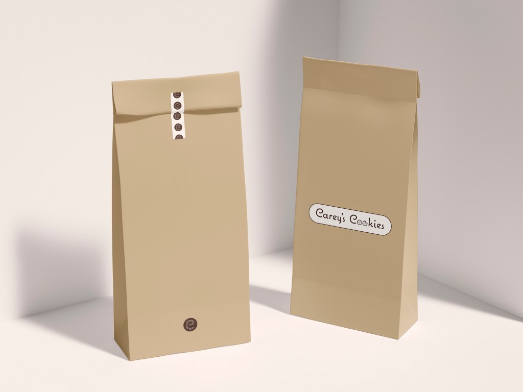
Finally, it was time to see what the brand would look like in practice! I found a mockup of what could be a paper cookie sack and inserted my designs. The result is pictured on the right. I really like how the final product turned out, and if I were to ever open a cookie shop, I would definitely want to use the brand I created!
I started out by asking myself what my storefront’s sign would look like if I had a physical shop. I knew I needed my entire company name on there and, since it was a cookie store, I wanted it to look fun and not so formal. Because of that, I decided to use a sans-serif, curved typeface. This embodies a fun and artistic personality. The typeface seen is a modified version of Adobe Fonts’ Coquette with the ends rounded for a friendlier, freer look.
Next came color. I originally went with black (taking inspiration from Crumbl Cookies), but the extreme darkness just didn’t fit with the vision I had for the company. After asking some of my friends and family members for their input, I eventually settled on a dark brown color. It represented sweetness (mainly chocolate) but was still dark enough that the logo would maintain a professional presence.
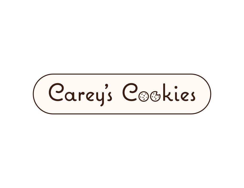
The basic design was finished! But if I was really starting a business, I wouldn’t want to put that design on EVERYTHING. I would want some variety. Plus, if I wanted to stick the design on packaging or use it as a label, it wouldn’t be very easy because it’s made up of separate letters. I needed a variation that would give the basic design a background to group everything together.
I was inspired by bakeries back in the early 1900s that would have a metal sign to denote their location. I decided to make my label variation in a similar fashion and put an oval background on the original design. For the background color, I used a light peach color to match the soft and sweet aesthetic of the company.